JR Chronicles
JR Chronicles is one of the largest solo exhibitions currently in existence. JR started his journey when he was only 15 when he would climb on buildings and write his name on the roofs and the walls. He later found a camera and decided to document his adventures. He then started printing his photos and framing them using spray paint. His career was kickstarted by showing these at his first gallery exhibition.
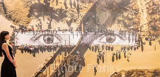
I chose this photo as it shows two different types of people bonding over a pair of people's eyes.
I found this profound and effective as it shows that one person unite a whole group of people together. |
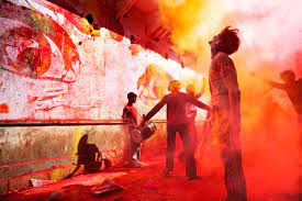
This photo really catches my eye because it is bright and energetic. It shows lots of different types of people bonding and having fun messing around.
The picture shows that although we all have different personalities we are all human no matter where we are from. |
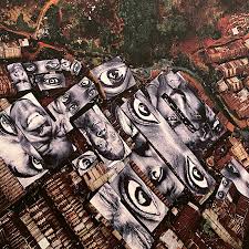
I chose this photo because it shows only people's eyes.
This shows that all human beings are similar physiologically and we all see the same things and sometimes feel the same things. |
JR Exhibiton trip
This week we went to JR's gallery and we wondered around finding out about his photos and art. I enjoyed this because JR really focused on making amazing photos which shows how much he wants his message that all humans are the same no matter what the ethnicity which shows that all JR wants is for people to be seen as equals and most of his photos only show the eyes of the subject or their face and he creates galleries around the world on the street for people to view and enjoy.
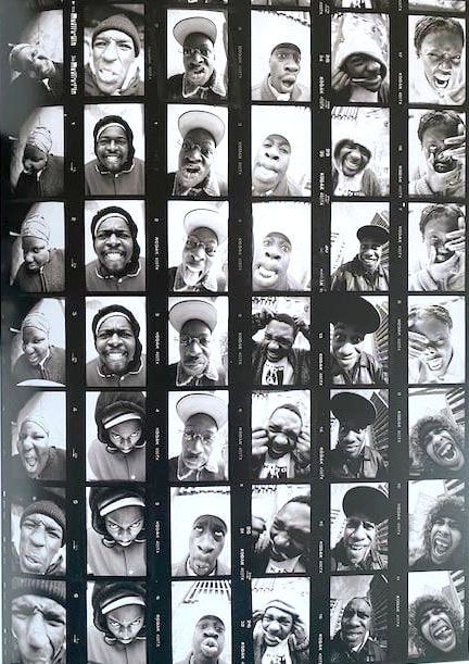
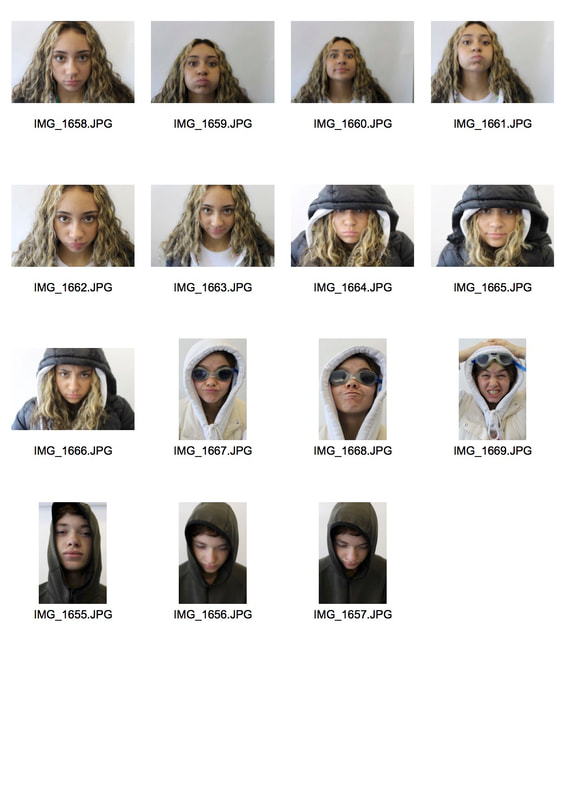
For this task I was required to take six to eight photos of a subject where my classmate had to pull many different faces in front of a 5 millimeter lense which means I had to take the photos quite close to get a good angle similar to the photos in the JR exhibition. In the photos that we took the subject had to make faces that were funny, silly and menacing. I chose a plain background so the viewer would not get distracted.
|
Here are some photos I took trying to copy the style of JR. I have tried to put them in an order of a contact sheet because then they are easier to view, I feel like it has worked and the photos are put in order of the how many photos I took of each individual person (As seen on the right).
|
|
Portraits
For this task we had to take photos of someone with a 5 millimeter lens. This means we had to zoom in to peoples faces, meaning very close images to the face. What went well was that the photos are close up and i think match well with JR's style.
What I would like to improve however is for the quality to be more clear. Also i would have liked to have captured more of an array of expressions.
What I would like to improve however is for the quality to be more clear. Also i would have liked to have captured more of an array of expressions.
Rasterbator
In rasterbator you are able to choose a photo and edit it, to a size of your choosing. The size and final choice can vary may from A5 or smaller to the size of a wall or billboard. You can do this by dragging an image into rasterbator, decide its required size and how many images you need and then the individual images are printed and you can then place these images together to create a new image that you have designed as a whole.
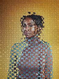
Artist page: Gordon mangin
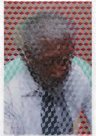
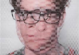
Gordon Magnin is an LA photographer who specialises in fashion photography where he creates his own unique style, by turning his images into collages with the use of geometric patterns. Mangin usually makes a complex photo which may make you feel uneasy or confused, he does this by adding lots of little geometric fragments of the photo to confuse the viewer. He also wants the viewer to consider how complex you can make someones face if you try hard enough by hiding their identity.
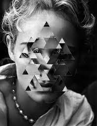
i like this photo as it shows this person's face changing very slightly and yet you cannot recognise the main facial features clearly this makes the viewer confused and interested.
|
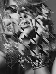
I like this photo as its almost completely opposite to the previous image. In this example he has radically altered the original portrait so the person is unrecognizable and the picture takes on an abstract quality.
|
Geometric Portrait
In this task I was required to take a photo then take it into photoshop where I would take parts of the photo and enlarge or rotate them to make the image more confusing and try to add more interest and an abstract quality to the photo. I also had to watch a step by step video on how I could use certain techniques to create this style of photo. This task represents the theme of fragments as we had to take small aspects of the photo out and rearrange them on the persons face or elsewhere around the original image.

For this task I made two small images that were influenced by Gordon Magnin's style. When I compare the moving image (lower down) and the photo I prefer the still image as I feel there is more to look at than the moving image and i have expanded the canvas by adding wider droplets of the photo radiating out from the original portrait. What went well in this image is that I used more circular fragments rather than sharper triangular shapes which brings a more unique aspect. What could be improved is how I displayed the individual fragments on the still image which could be placed in a more repetitive geometrical layout. For the moving image i think i could have improved it by having more than a single spinning fragment.
how its made
|
|
To make this image I had to choose a shape out of many in the photoshop library, then select my prefered photo of the subject. I then made a new layer and on that new layer I created the fragment of the photo I wanted to paste onto the original image. I repeated this process many times changing the size and rotation of the shape until I was satisfied with the composition of the image.
|
Extension Task

GIF
The subject I decided to pursue was a person who stood in front of a white backdrop for this task I had to take 4-5 photos where he stood still. I also used a fast shutter speed as i waned to capture the subject of the photo so they aren't blurry making it harder to view. Next time i will use a tripod as then the photo may be able to get a better angel and be more balanced.
For this task we had to cut and then fill in block colour all the things surrounding my portrait and then do the same with my profile, which made my image seem more like a cartoon. My image expressed my intentions to create an abstract graphic. I really liked the final outcome as there isn't a lot of muted colours, there are only block colours, which make it easier to focus on the graphic image. I found the editing process fun yet challenging as I was using the magnetic line which kept de selecting an area when I was going over some of the complex bushes and trees.
This is the process I undertook in photoshop
,What went well in this image is that it is saturated in block colour very well, making it look more like a cartoon or animation. This is good as this technique can be used to both confuse or intrigue the viewer. What I would like to improve however is that left some gaps so the viewer can see the real background in a couple of places which detracts from the illusion.
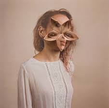
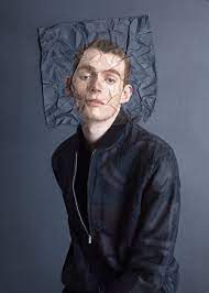
Almer haser-cosmic surgery
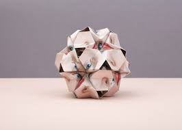
Cosmic surgery focuses on body type and changing the body to its limits so it looks slightly unhuman, however what Almar Hasar does is she makes her images 3d and changes the form of the subject in the photos. Furthermore she wants people to consider the link between identity and appearance, she does this playfully combining collage sand origami. Her process has three stages, first she prints multiple images, then folds them into complicated origami modular construction, which then gets placed onto the original photo, then the whole thing is photographed again.
|
|
|
My Response
In this task I was required to choose two photos from a selection and then had one outline of what we had to cut out from one of the photos and then we were supposed to fold it into a shape and stick it together to create a 3d shape. Once the 3d shape was made we had to stick it on top of the original photo wherever we wanted and so I chose to make it look as close to the actual photo as possible So it would confuse the viewer more.

|

|
What went well in these photos is that my aims of making the image as abstract as possible came across well as the photo seems completely fine however< there is a single piece in the photo which bulges and looks different which is used to bewilder the viewer.
What I would like to improve however is the lighting and the neatness of the image. As in the first photo you can see the background and the light is making a shadow which ruins the illusion of the photo as you cant see it all as bright and clear as can be. Another issue is that when I had to get a certain angle the background was included which was very messy and ruined the photos tidiness and took the focus of the subject.
What I would like to improve however is the lighting and the neatness of the image. As in the first photo you can see the background and the light is making a shadow which ruins the illusion of the photo as you cant see it all as bright and clear as can be. Another issue is that when I had to get a certain angle the background was included which was very messy and ruined the photos tidiness and took the focus of the subject.
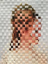
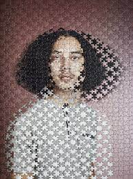
David Samuel-Weaving
American photographer, David Samuel has created a project entitled "woven portraits". His process is getting two separate prints of the same module together by doing this it does not only offer his subjects a way to hide within themeles but also turns digital photography into physical objects. David Samuels intentions is to link someone to themselves leaving their identity inside the photo.
|
|
|
my response

For this task we were given two pieces of card to cut into strips and then weave them together. We learnt this process through a video in which there is a step by step guide to teach us how to do it. What went well in this photo is that it shows clearly that I have woven two photos together and achieved an interesting effect in the style of David Samuel. What I would like to improve on however is how bright the photo is as it is very dark making it hard to see the photo. Also the image could fill the canvas better.
Irene sheri
Irene Shelli is an artist who's whole style is romantic impressionist. Her whole career started when she was told not to touch some paints. After that she started painting on everything so she therefore made a career of it. Her style also explores motion and nature. This could show the romantic impressions as beauty, usually in nature as new biomes.
Her Work
kehinde Wiley
Kehinde Wiley, American artist best known for portraits that feature African Americans and gives them a choice of which famous photograph they want to pose as then he edits the background so its as if they are their own famous photo. What I like about his images is that he changes the background to a pattern and doesn't keep it the same and he makes people distinctive and placed outside of their expected environment.
first response
|
|
What went well in this image is that the image looks mysterious and builds curiosity and it also relates to the famous photo as both heads are turned and they both are staring at the camera which makes them look similar.
What could be improved however is the detail and amount of the collage that overlaps the photo as it seems a bit untidy which distracts the viewer from the portrait. |
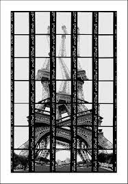
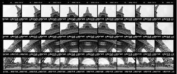
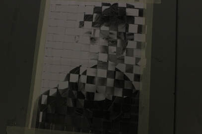
Thomas Kellner
Thomas is a German fine art creator, through his formatting he takes photos of famous architectural monuments, which, through many individual images and a shifted camera perspective, look like "photo mosaics" after he has edited them, this makes a structure or building the subject of his photo. He then edits it so its scattered everywhere confusing the viewer
examples of his work
|
|
|
my response

what went well in this photo i
|

|
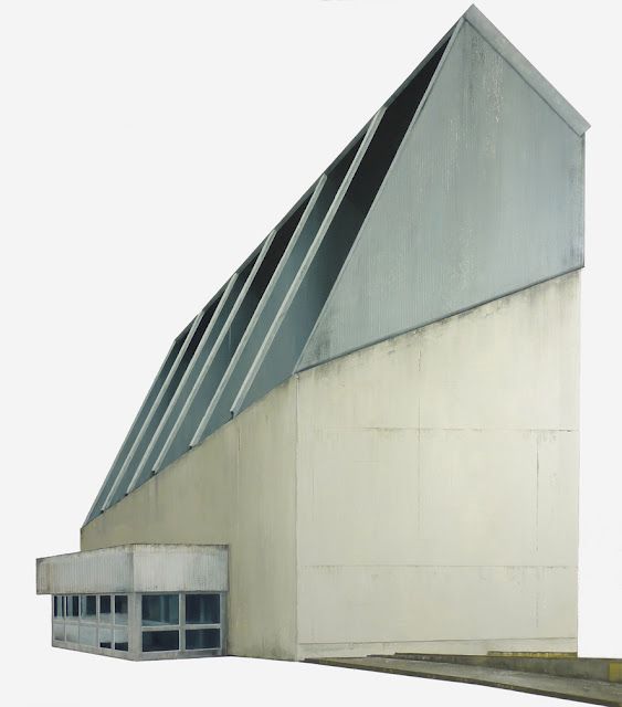
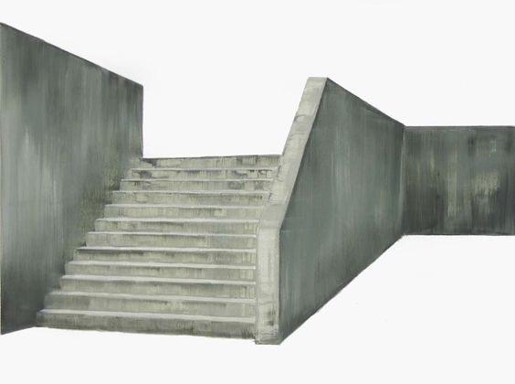
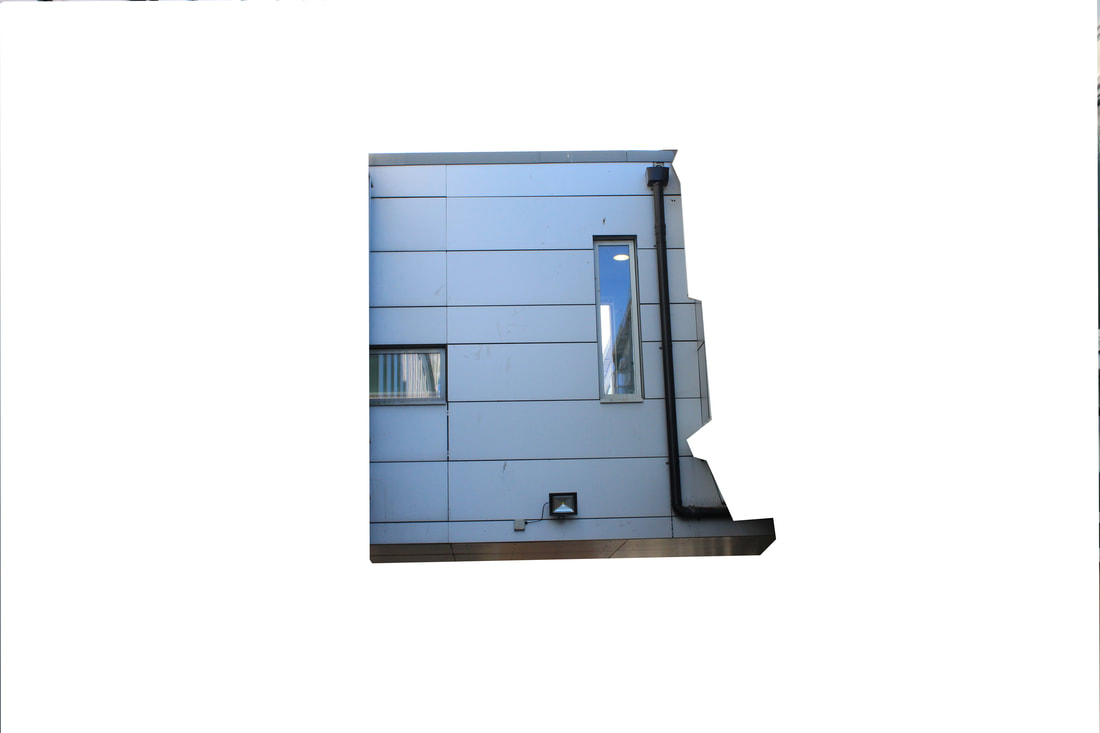
Artist page:Patrick Cornillet
Coenillet takes photos of famous buildings or structures and once that's done he makes the background completely clear making the subject of the photo even more 3d than the original. As there isn't any context to compare the image to, you don't know how 3d everything else around it is and the image seems to float.
|
|
|
my response
|
|
|
Artist Page: Sun Ji
Sun Ji is a photographer that takes photos of building from all angles then puts them all into one collage which makes one giant building made of multiple smaller buildings the subject of the photo this could bewilder the viewer as there are many buildings merged into one making there be both one and many subjects of the image.
|
|
first response
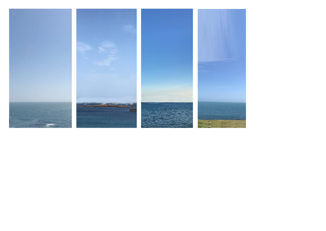
this is my personal favorite as its all diffrent places however they are all connected in one way the way being the sky and the sea what went well in the photo is they all link together and are on a perfect level. However what could be improved could be how well they line up due to one of them being a tiny bit off.
|
Well done Jack some good work her but please remember to go back over your work and add clear intentions to each task clearly mapping out what your intentions are for the shoot and how your work links to the work of the artist you have been looking at.
Where are you three strands you need to upload all images taken and clearly mapp out the artist you are looking at at then show your responses.
If you are stuck develop the work of Irene sheri using images you have taken or as a worst case scenario pictures that you have found on the internet
COPY AND PASTE SENTENCE STARTERS TO IMPROVE THE QUALITY OF YOUR WRITING. DO NOT DELETE. LEAVE THIS TEXT BOX AT THE BOTTOM OF YOUR PAGE.
Annotation
Introducing a task:
Subject matter
ebi:
Subject matter
What’s next
Analysis
What do you think the photographer’s intentions are? There may be more than one. ‘PEC’ each intention.
P (Photographer’s name) creates (what type of images? Fantastical, surreal, objective)
E He / she does this by… (describe something in the image)
C He/she wanted us to consider ….
What wider issues is the photographer addressing?
P (Photographer’s name) is considering (is the photographer talking about a bigger issue in photography, society, politics?)
E This is shown by … (describe something in the image)
C The (Photographer’s name) was interested in this issue because (they felt it was relevant to us now…)
How do the materials and techniques used support your photographer’s intentions?
P (Photographer’s name) has used (the darkroom / multiple exposure / film / digital manipulation techniques) in creating
this work.
E This creates a ______ effect. (describe something in the image)
C This helps to support (Photographer’s name) point about (showing an identity / hiding a person’s identity / the media
/ anonymity)
Annotation
Introducing a task:
- In this task I was required to…..
- This task links to the theme, (project title) as it shows....
- My intention was to respond to ……. because I wanted to explore....
Subject matter
- The subject I chose to photograph suited the theme as it……
- My composition helped to support my response to the theme by….
- I managed the exposure very well. My ISO / shutter speed / aperture settings were…..
- I prioritised my shutter speed to… (capture movement / blur/ frozen moment)
- I prioritised aperture to manipulate depth of field.
- I used a tripod to avoid camera shake.
- My images express my intentions which were…
ebi:
Subject matter
- The subject I chose to photograph did not necessarily fit the brief as it was not interesting enough / appropriate / adequately lit…..
- Next time I should go to (a different location), photograph at a different time of day, organise people in advance, think more about my composition so that….. ect
- I did not create enough depth of field / sense of movement. The image is over exposed / underexposed / too blurred.
- Next time I should use a tripod / use a different type of lens (be specific) / experiment with film…
- My images do not show my intentions which were…
- The concept wasn’t clear in my images, I need to make it more explicit by…
What’s next
- Next time I will consider the work of (a photographer) to inspire a more accurate depiction of what I want to achieve.
- I will experiment further with… (blur / shutter speed / composition)
Analysis
What do you think the photographer’s intentions are? There may be more than one. ‘PEC’ each intention.
P (Photographer’s name) creates (what type of images? Fantastical, surreal, objective)
E He / she does this by… (describe something in the image)
C He/she wanted us to consider ….
What wider issues is the photographer addressing?
P (Photographer’s name) is considering (is the photographer talking about a bigger issue in photography, society, politics?)
E This is shown by … (describe something in the image)
C The (Photographer’s name) was interested in this issue because (they felt it was relevant to us now…)
How do the materials and techniques used support your photographer’s intentions?
P (Photographer’s name) has used (the darkroom / multiple exposure / film / digital manipulation techniques) in creating
this work.
E This creates a ______ effect. (describe something in the image)
C This helps to support (Photographer’s name) point about (showing an identity / hiding a person’s identity / the media
/ anonymity)
Strand 1: Alma Haser
Alma Haser was born in Germany and now is based in London. She is known for her complex and meticulously constructed portraiture, which are influenced by her creativity and her background in fine art. Alma forms striking work that catches the eye and captivates the mind because she expands the dimensions of traditional portrait photography,
Alma takes her photographs and turns them into 3D by using inventive paper-folding techniques, collage and mixed media to create layers of intrigue around her subjects; Alma has won many awards for her work, and won the PDN Photo Annual Award in 2016 for her Eureka Effect series. Her work has been exhibited worldwide and in recent venues have included the 2017 Saatchi Gallery show "From Selfie to Self-Expression".
Alma’s current projects include the Twin Puzzle series, delving into her fascination with identical twins,
|
|
|
Some Example of her Work are shown above
I chose Haser to be one of my three strands photographers because her weaving work particularly interests me. I really like using my hands to make patterns because its very satisfying seeing the final product of your own hard work, .
my response

|

|
|
|
I particularly found these photos rather fun to edit due to the message it can send. Message being "no matter what angle you get of someone its the same identity" or "there are many sides to us".
However what could be improved is how well the different angles sink into one another because at the moment there seems to be one main side which is more visible which takes away some of the message. |
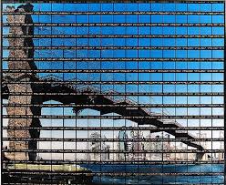
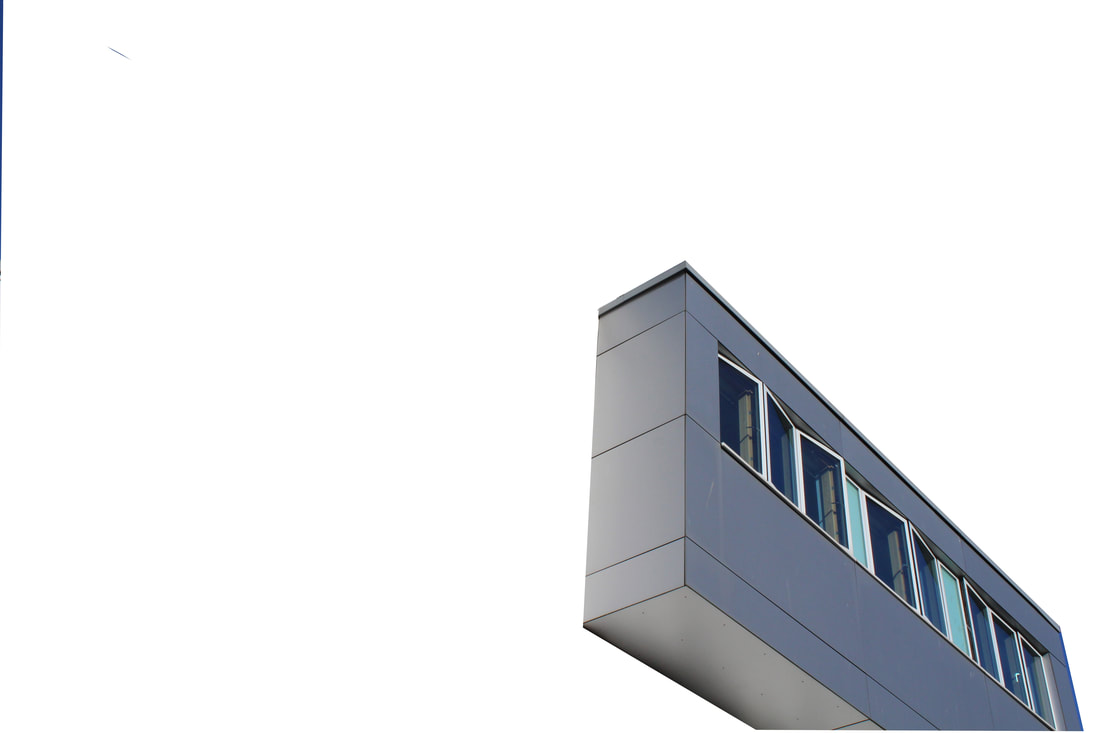
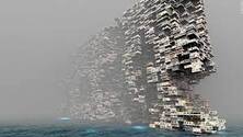
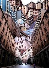
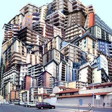
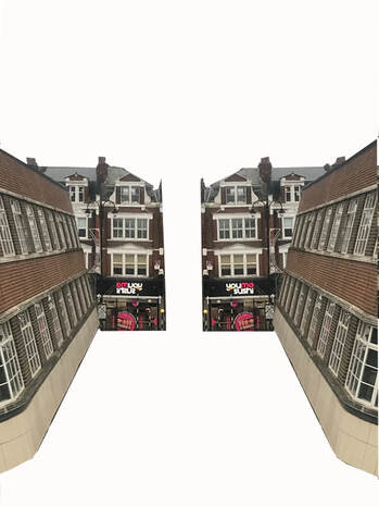
strand 2: Giacomo Costa
|
|
|
costa takes photos of buildings and then brings them all together making them rather into one big building or structure he is also raising money for the planet at the moment to raise awareness. I chose costa as my second strand as I like the idea of buildings becoming one big structure as it confuses the viewer which I aim for.
my response
|
for this set of images i chose an array of images of buildings i have taken and edited them into one big building or landscape.What i particularly like about these photos is the fact that they are all from the same place but put together they build somewhere that is so different.
On the other hand what i would like to improve is if there were more shading or more of a background as then it could make more of a spectacle for the viewer to look at. |
|
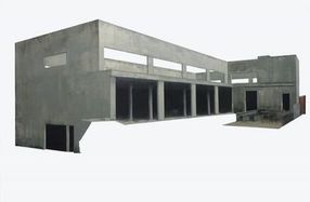
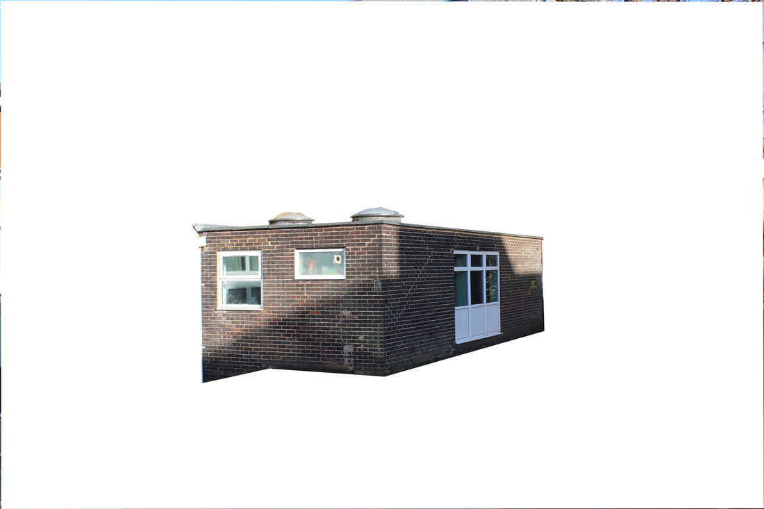
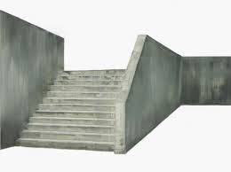
strand 3: Patrick Cornillet
In his new series, started end of 2014, Patrick Cornillet, paints all of the surface of the board The infinite nuances of concrete, make us aware of the wealth of the material and of the remains left by the humans This rendering is eye-catching and raises questions.
Even if the architectures seem austere, spaces seeming uninhabited, dehumanized, Patrick Cornillet, with this very mastered work of an incredible strength creates a particular poetry and a mesmerizing mysticism. It is necessary to note that the paintings are all painted on elegant white wooden boxes, conferring on the "canvass" the status of a 3D object.
Even if the architectures seem austere, spaces seeming uninhabited, dehumanized, Patrick Cornillet, with this very mastered work of an incredible strength creates a particular poetry and a mesmerizing mysticism. It is necessary to note that the paintings are all painted on elegant white wooden boxes, conferring on the "canvass" the status of a 3D object.
|
|
|
my response
|
|
what i like about this image is that it shows a small sense of the theme of being synchronized or symmetrical i like these themes as it makes it seem like its the same place hower it confuses you trying to think of which one is real this could build a sense of confusion and bewilderment which is the aim of this image.
However what i would improve about the photo is i would add more buildings so there is more for the viewer to look at. |
Final Project
For my final project I have taken inspiration from both Alma Haser and Giacomo Costa. I wanted to merge both these photographers styles into one photo, I did this by getting four separate photos of different people's faces and putting different backgrounds in their silhouettes.
After I did this for all four photos, I cut them into quarters because I wanted to divide the images in the style of a pattern that Alma Haser would use. Then I connected the images inside the faces so that it creates one big silhouette. I replaced the inside images of the silhouettes by connecting different buildings. I wanted to use images of buildings because they can display different aspects of someone's personality and we never know what might be going on inside.
The message I want to send through this final project is that no matter what the appearance on the outside, people connect to each other in ways that aren't visible.
|
|
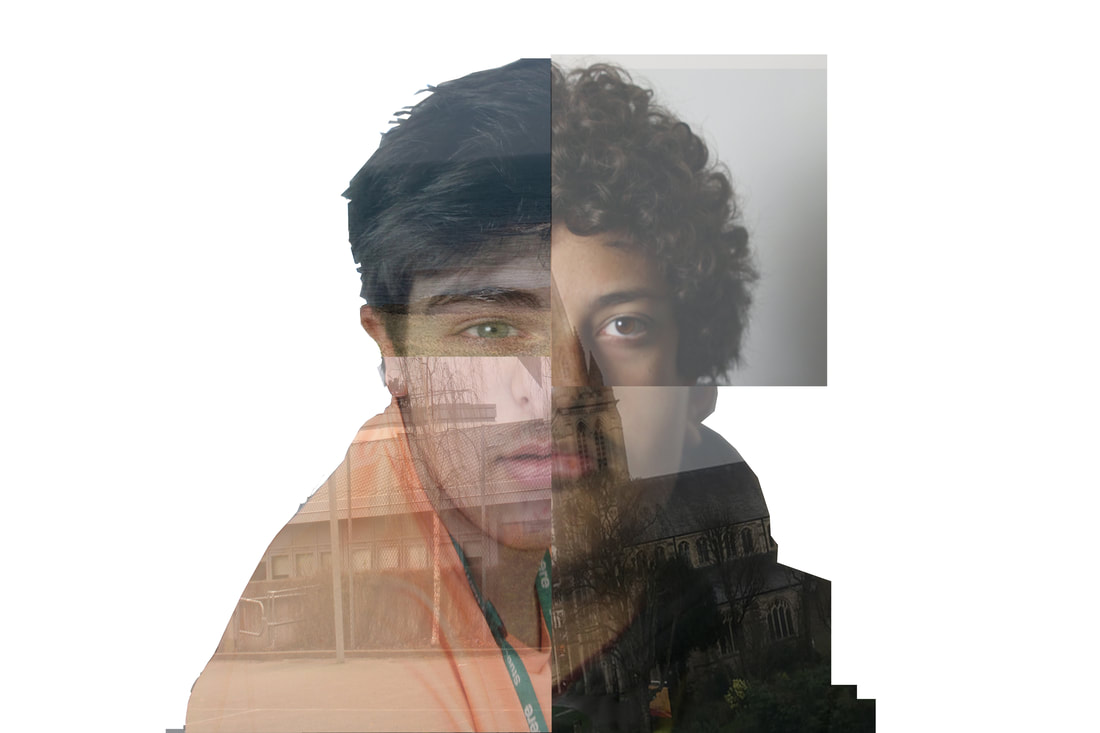
what went well in this image is that all the faces in the photo connect well to each other creating a nice tranquil effect.
What could be improved however is how well the backgrounds combine because it is noticeable that some of the buildings don't connect ruining the effect that i am aiming to create. |
